Enduring Color and Texture Frameworks for Year‑Round Style
Build a Year‑Round Palette That Breathes

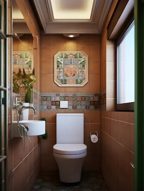
Choosing Anchor Neutrals

The Power of Undertones
A Living 60‑30‑10 Ratio
Tactile Layers That Adapt with the Weather
The Seasonal Color Dial
Four‑Season Accent Families

Saturation and Value Mapping
Patterns That Carry You Through the Calendar
Scale‑Stacking Method
Unifying Motif Threads
From Pattern to Texture
Materials with Character and Longevity
Core, Sustainable Choices

Performance Fabrics, Real Life
Light as the Hidden Colorist
CRI, Simply Explained
Layered Lighting Scenarios
Harnessing Windows and Sun Angles
A Real‑Home Transformation and Your Action Plan
01
Before: Fragmented Choices
Maya loved indigo, blush, emerald, and mustard—simultaneously. Without undertone alignment, colors argued; textures felt seasonally confused. We tested swatches in morning and evening light, identified warm gray with a soft green cast as anchor, and selected oak tones to harmonize. Immediately, existing art looked calmer, richer, and more intentional.
02
After: Cohesive, Flexible Flow
We defined a green family across seasons, swapped heavy velvet for linen in summer, and introduced brushed brass near winter. Patterns followed a scale‑stacking plan, and lighting received high‑CRI bulbs. Now, quick accent rotations mark holidays and micro‑seasons while the core stays steady, inviting, and uniquely hers—no constant reinventing required.
03
Your 7‑Day Refresh Plan
Day one, test large neutral swatches in shifting light. Day two, pick an accent family. Day three, build a 60‑30‑10 map. Day four, assemble a texture swap bin. Day five, audit patterns. Day six, tune lighting. Day seven, photograph results and comment with wins or roadblocks for personalized, friendly feedback and next steps.